2024artlogic redesign
I redesigned Artlogic’s inventory system to reduce onboarding time and simplify daily workflows for gallery staff, based on direct experience using it for over two years.
Skills
User Research, Wireframing, UI/Product Design
introduction
Artlogic’s services cover a wide area.
This redesign focuses on their gallery management; more specifically, inventory management.
Inventory management in galleries involves tracking artworks, consignments, locations, condition reports, and client records—all of which must be fast, reliable, and error-resistant.
So, what exactly is the problem?
Their design looks quite squared away when interacting with their website:
the problem
The Artlogic web app lacks the polish and design thinking shown on their website.
After spending hundreds of hours using it as a gallery assistant, I realized that most time is lost navigating the system—and this friction persists even after users become proficient.
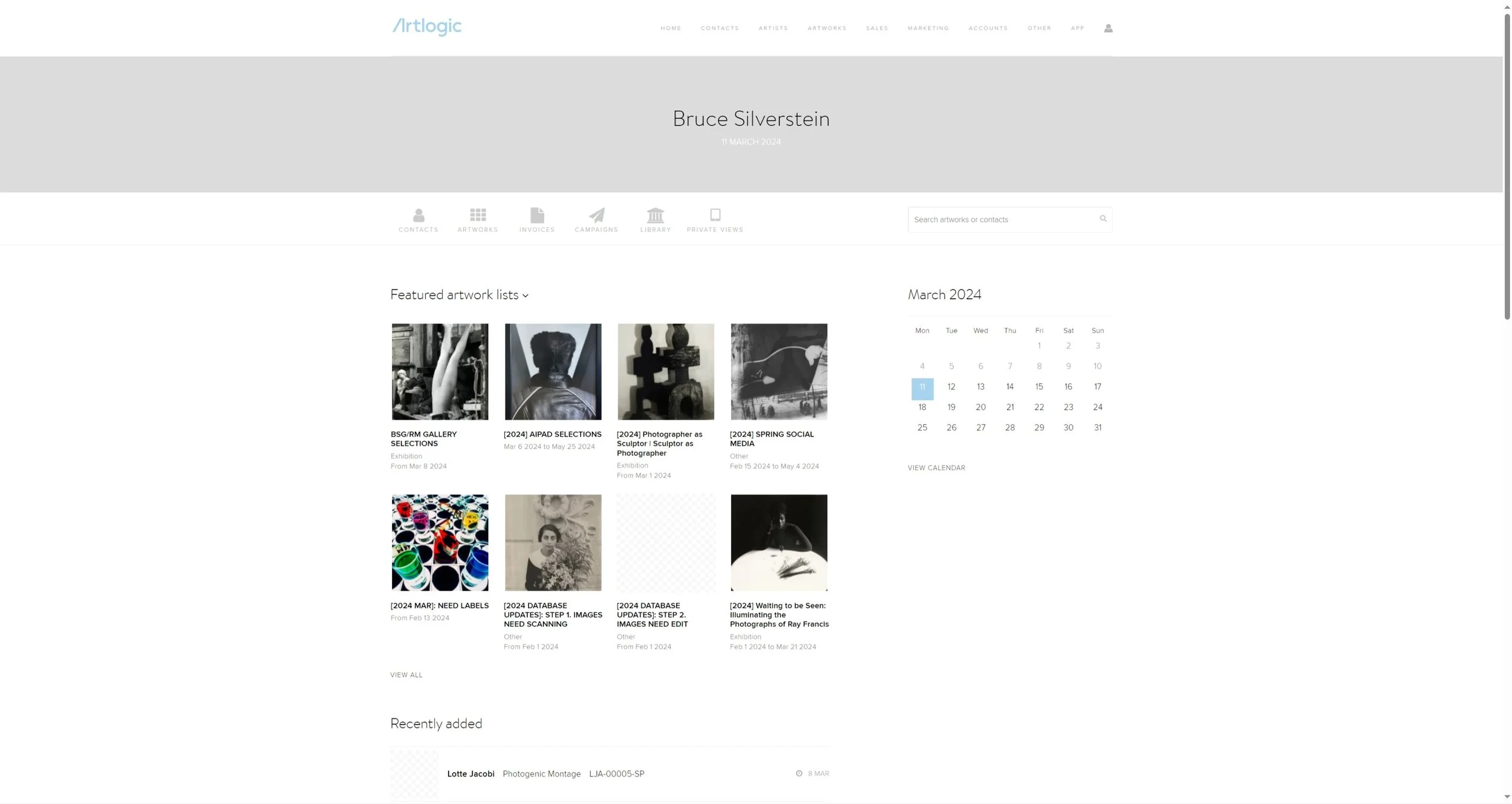
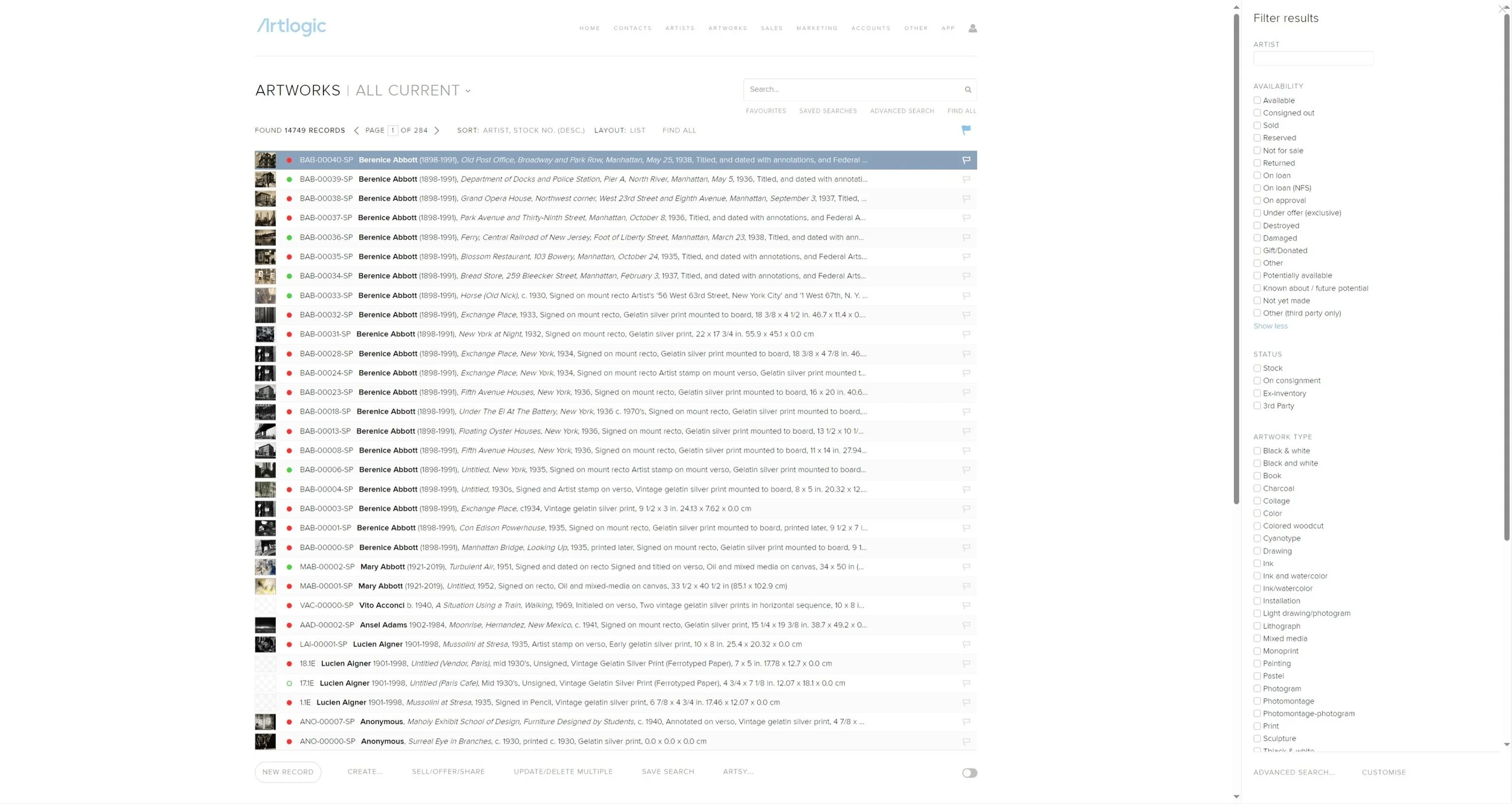
* These are screenshots taken from the gallery I used to work at. No sensitive information is shown here as content is already 1+ year old.
research
To clarify why Artlogic’s inventory system felt difficult to learn and frustrating to use, I combined user research with expert evaluation methods. My goal was to uncover real workflow friction and identify opportunities for a meaningful, high-impact redesign.
Scanned adjacent inventory tools to understand common UI patterns and industry expectations
Market Scan (Competitive Analysis)
Spoke with gallery staff, registrars, archivists, and assistants to uncover daily pain points, unclear labels, workflow gaps, and areas of repeated frustration
User Interviews (32 Participants)
Heuristic Evaluation
Reviewed the product against Jakob Nielsen’s 10 usability heuristics to identify major UX violations
Observed coworkers completing routine tasks—uploading artworks, updating statuses, exporting documents, and managing lists—to map real workflows and highlight repetitive or multi-step actions
User Flow Shadowing
key insights
Across interviews, observations, and expert analysis, several consistent themes emerged:
Navigation friction was common, with users relying on trial-and-error to locate actions.
Labels and terminology were often unclear or inconsistent across pages.
Multi-step tasks (uploading, filtering, exporting) took longer than necessary.
System feedback was unpredictable; some actions showed clear loading states, while others showed none.
User skill disparity was significant: advanced users worked far faster, but beginners struggled to reach proficiency.
Core workflows repeated unnecessary steps and lacked clear hierarchy or prioritization.
supporting data
~91%
of individuals think ArtLogic has a steep learning curve
6
months is the average time the group thinks it takes for someone to become proficient in the program’s basics
~44%
are still uncomfortable
with the full range of functionality the program offers
* Stastics were derived from user interviews done with 32 individuals of varying skill levels, ranging from 6 months to 3+ years of experience
heuristic evaluation
The evaluation revealed the most severe issues around consistency, visibility of system status, and error prevention. Lower-severity heuristics (Recognition and Match to Real World) scored higher.
* Rationale included when expanded; screenshots unavailable as they contain sensitive information.
-
There were inconsistencies across the site where some actions provided clear feedback (e.g., loading bars or commentary states), while others offered almost none (e.g., a single static statement with no indication of progress).
-
Language was generally accessible, though some domain-specific terminology is unavoidable in an art inventory system.
-
Undo and redo were not supported after certain actions, limiting users’ ability to recover from mistakes. Ways to exit interactions existed but were often unclear or difficult to locate.
-
There was a lack of consistency across many actions—even when performing the same action in different contexts. Warning dialogs appeared for only some potentially risky operations. This inconsistency frequently led to unintended results.
-
Warnings were present but not always obtrusive or noticeable enough to genuinely prevent errors.
-
Elements and actions were generally visible and available across interfaces, supporting recognition.
-
Advanced users can operate the program at roughly three times the speed of novices. However, this flexibility also makes the learning curve extremely steep; shortcuts often become dead ends for beginners.
-
The design prioritizes information over aesthetics, which is appropriate for the domain; however, some consideration for information overload would still be beneficial.
-
Because warnings were inconsistent and not always prominent, users did not always receive clear cues when errors occurred.
-
Attempts at documenting the web app exist, but the extensive flexibility of the system makes it nearly impossible to document all cases comprehensively.
design audit
Landing Hub
Main Inventory Page
Consequent goals
A
Flatten the Learning Curve
Consolidate redundant navigation features
Align web app aesthetics with advertised aesthetics without sacrificing information accessibility
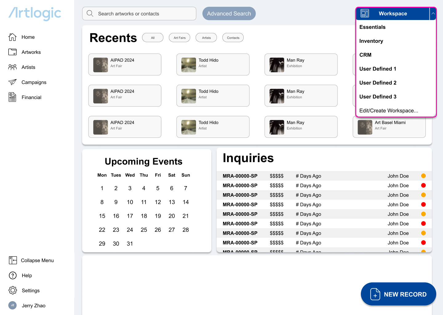
Create fundamental workspaces
B
Support Advanced Users
Introduce advanced modular workspaces as different roles
have different needsKeep enough of the skeleton of the old format that older users can pivot over
The solution
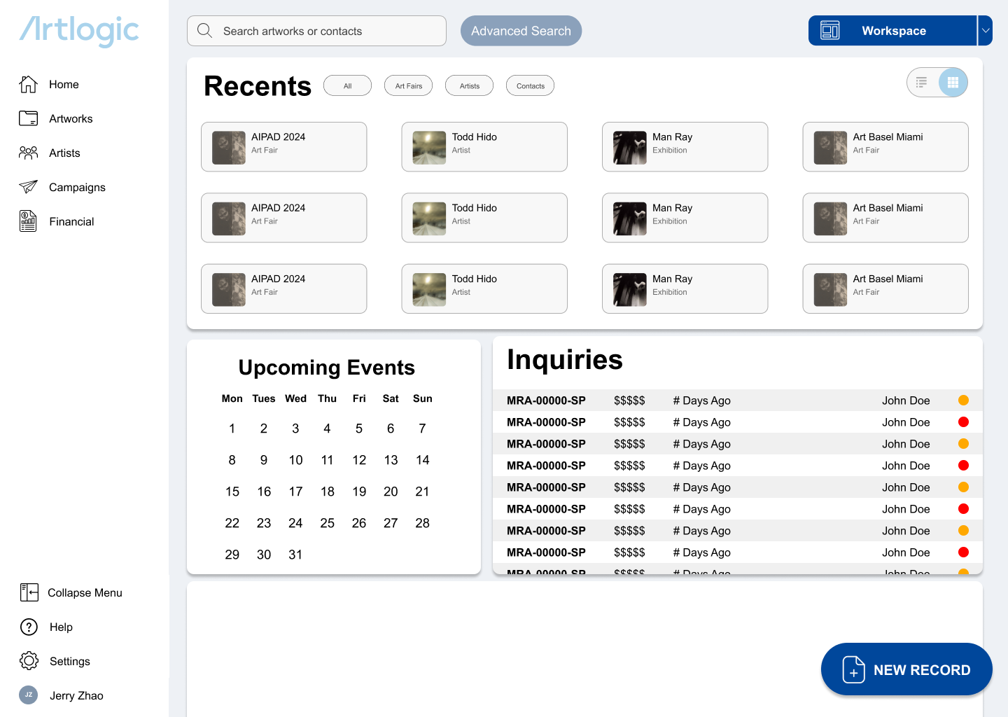
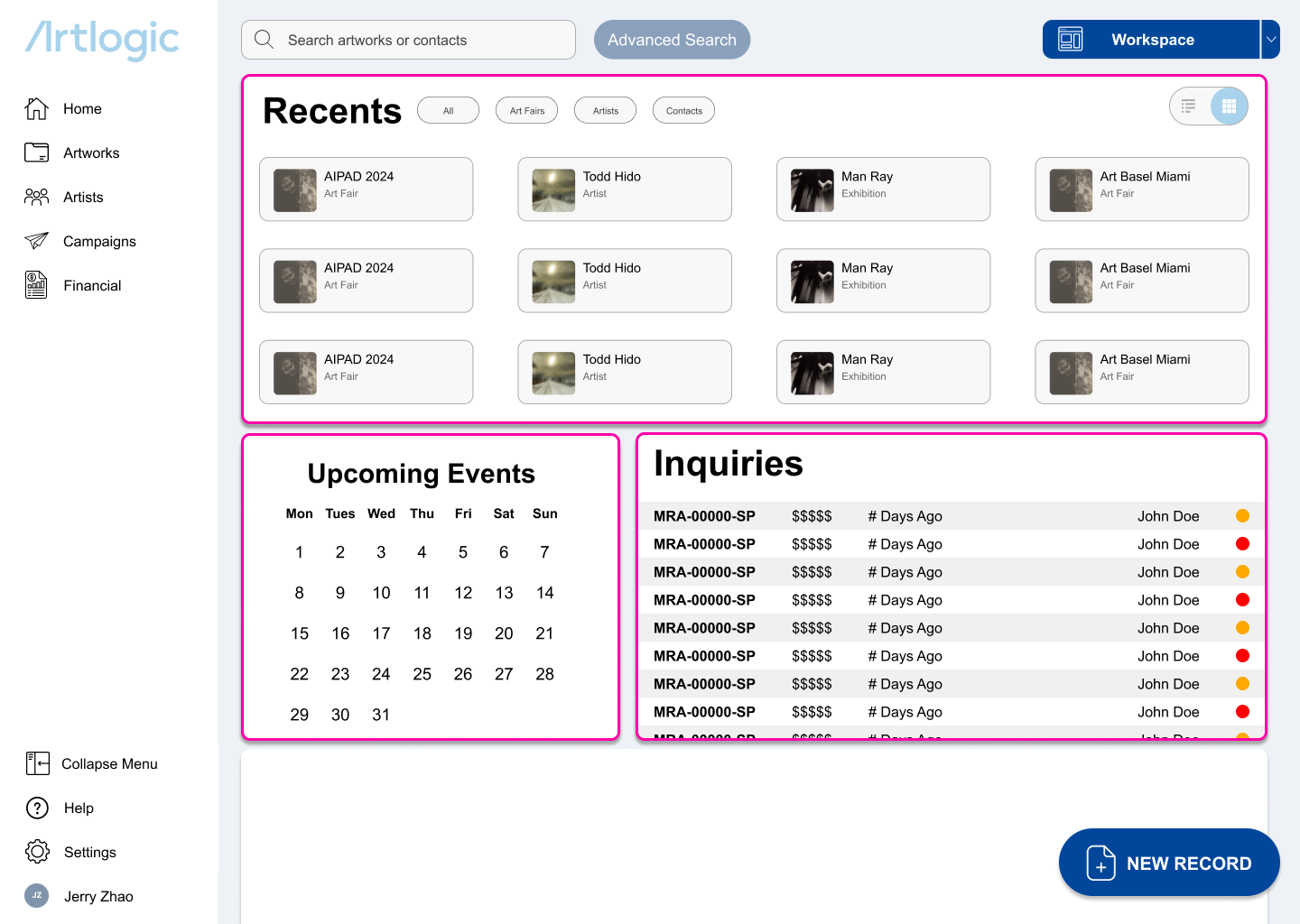
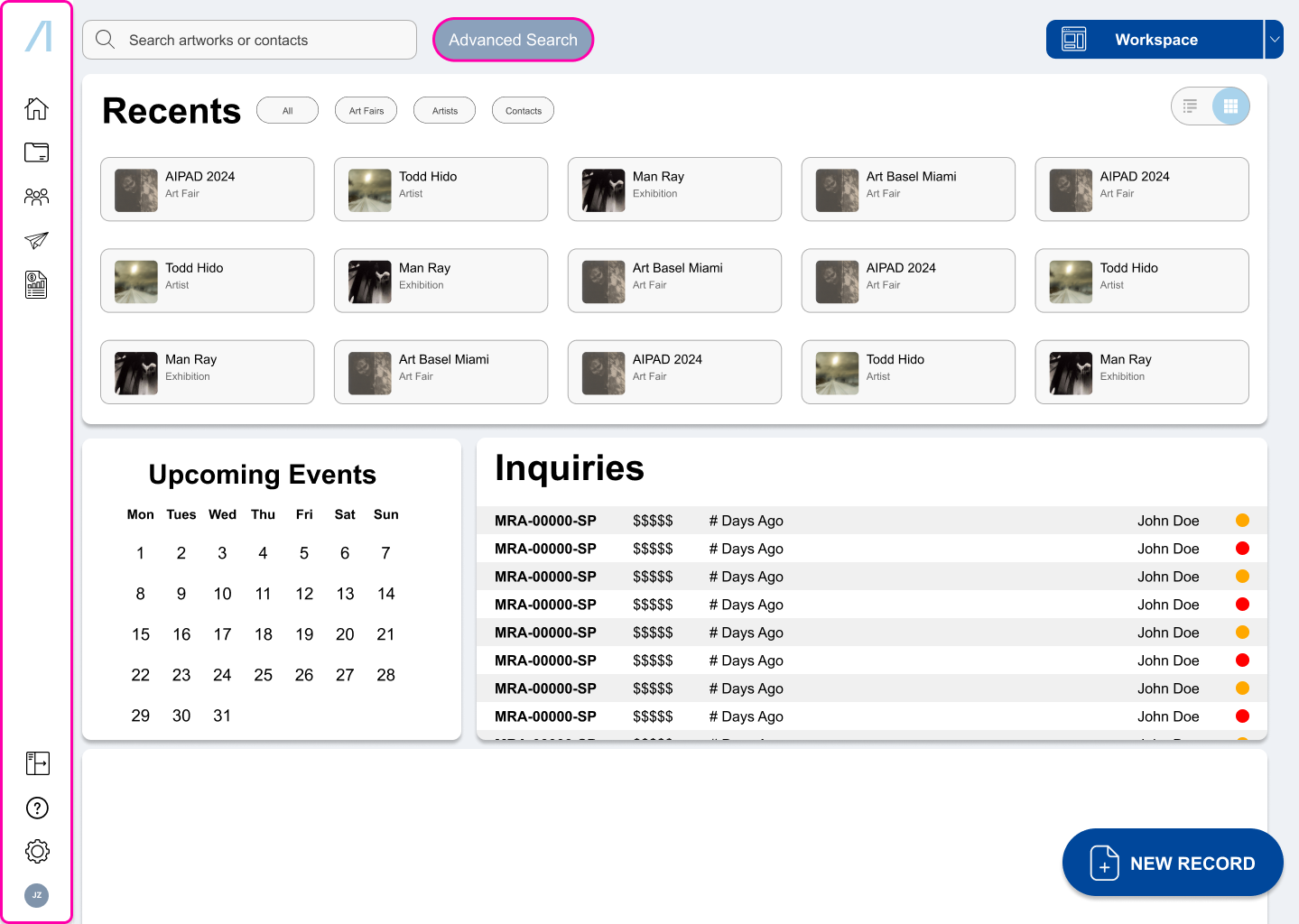
I chose to merge the two most used pages because almost every function in the home page was defunct or could be performed faster in the list view.
new features
Modular Workspaces
A flexible system designed to adapt to different skill levels:
Guides new users through curated pre-made workspaces focused on the most common daily tasks
Empowers advanced users to build personalized layouts tailored to their individual workflows
Legacy/Modern Toggle Switch
A bridge between old and new workflows:
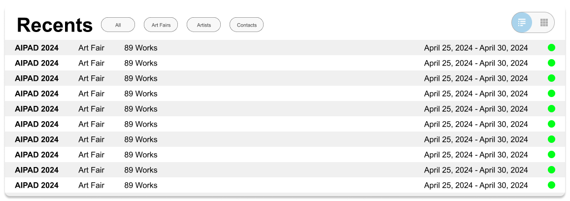
Preserves the legacy, information-dense layout for experienced users who prefer a data-first, image-free interface
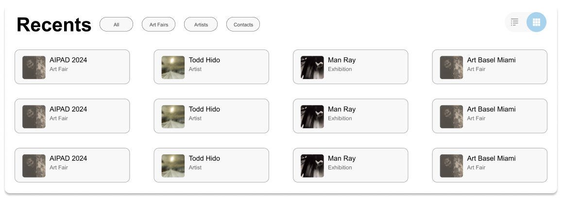
Introduces a modern, visually intuitive mode inspired by the original Featured Artwork Lists page—streamlined for readability and automatically updated to reduce maintenance
Improved Error Prevention
Clear guardrails to prevent disaster:
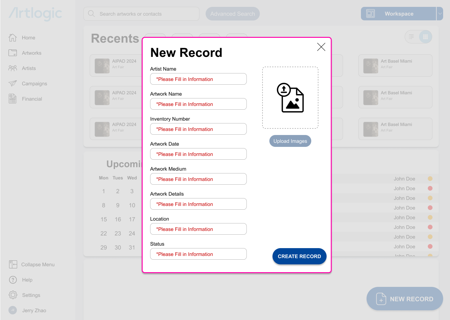
Contrasting red text and lock on moving forward until required information is provided
Real-time validation prevents errors early, highlighting missing or incorrect fields before submission
Additional Features
Unified advanced search into a single, accessible section
Collapsible side menu with new utility icons
next steps & Reflection
This was my first UX/UI project, and it taught me how to balance thoroughness with momentum.
I conducted extensive user interviews that validated existing pain points, but I learned I should have moved into prototyping and testing earlier to validate solutions, not just problems.
In future projects, I'd use research more strategically and test iteratively throughout the design process.

