UX/UI • 2024
Artlogic Case Study
Skills
Product Design
User Research/Interviews
Brand Cohesion
Tools
Figma
Timeline
1 month
Role
Product Designer
Overview
A redesign of Artlogic’s artwork inventory system to simplify daily workflows for gallery staff.
Based on direct experience from working with it for 2 years.
⚠ I am currently revisiting this project, and there will be many changes based on my reflections here.
The Problem
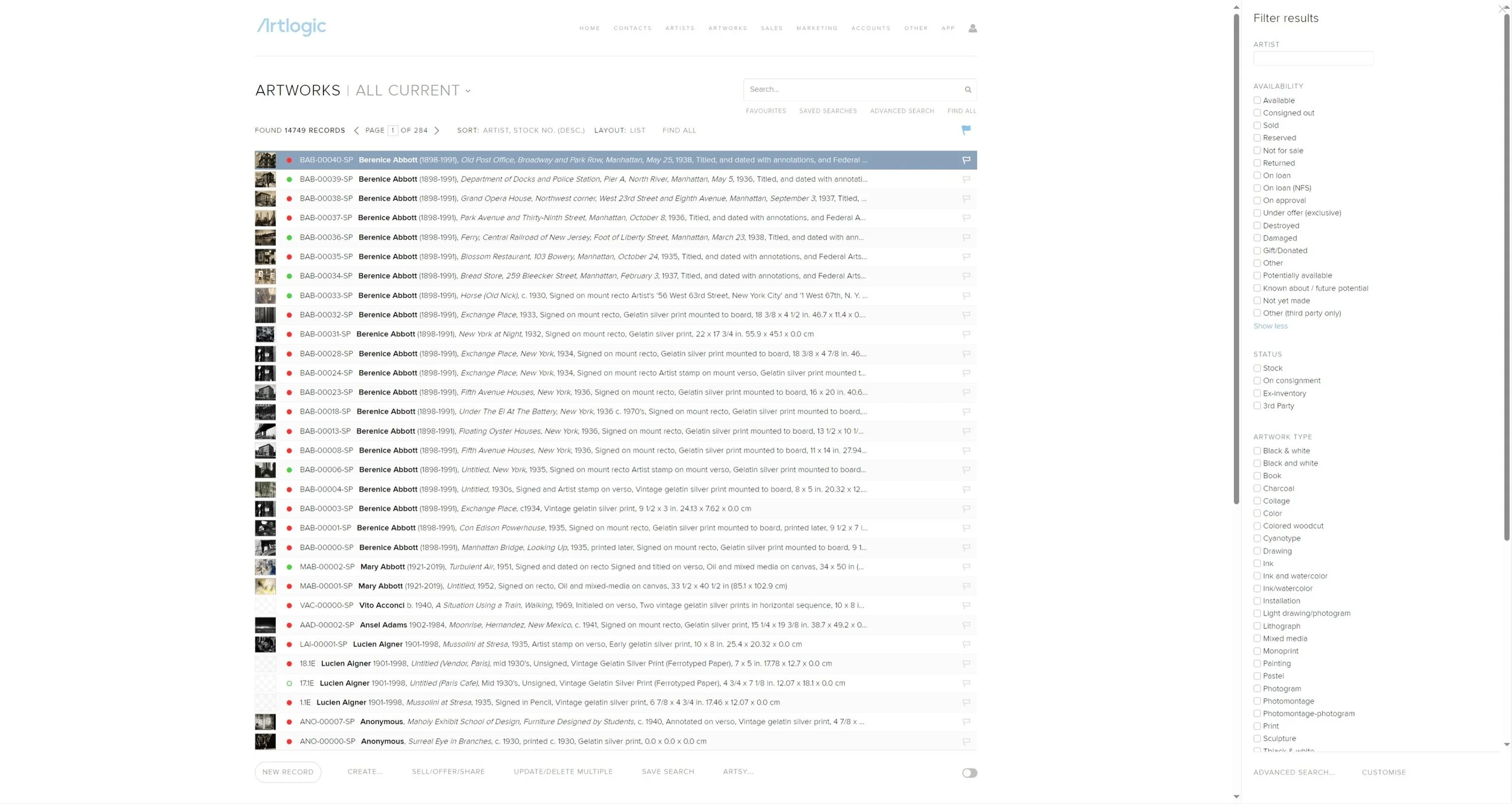
Artlogic’s web app is convoluted and outdated compared to what they advertise.
Their actual product is both unappealing and non-functional compared to their advertised aesthetic.
User Research
32 interviews, 2 recurring points.
Friction is everywhere in their system.
For newer users, the primary method for navigation was trial and error rather than hierarchy pointing in a direction.
Consistency and standards are not upheld.
Identical processes used different wording while different processes sometimes used the same wording, leading to unintended results, often with no warnings or ways to go back.
Notable statistics from the interviews:
~91%
of individuals think Artlogic has a steep learning curve
3
months is the average time the group thinks it takes for someone to become proficient in program basics
~44%
are still uncomfortable with the full range of functionality the program offers
Goal:
Flatten the learning curve while still supporting advanced users.
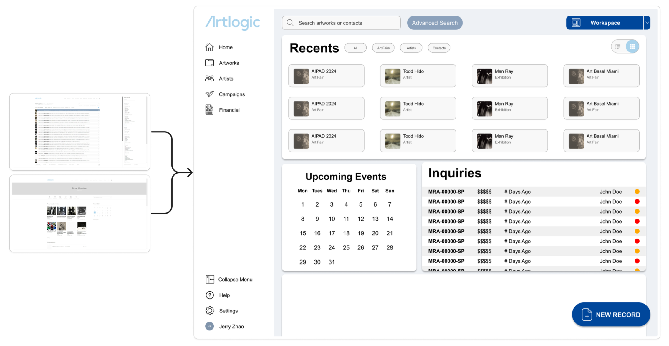
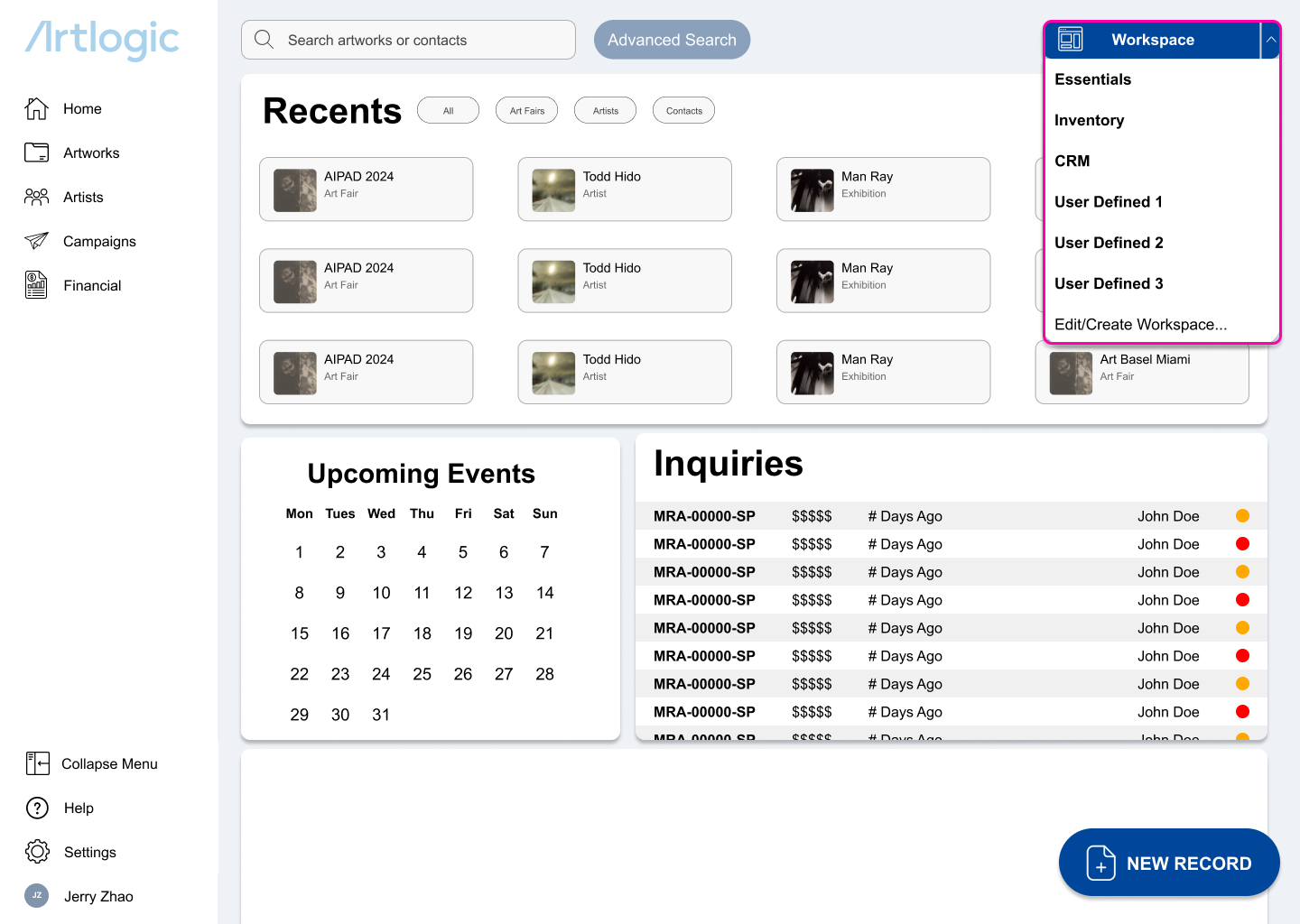
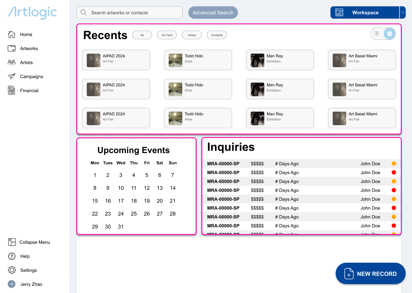
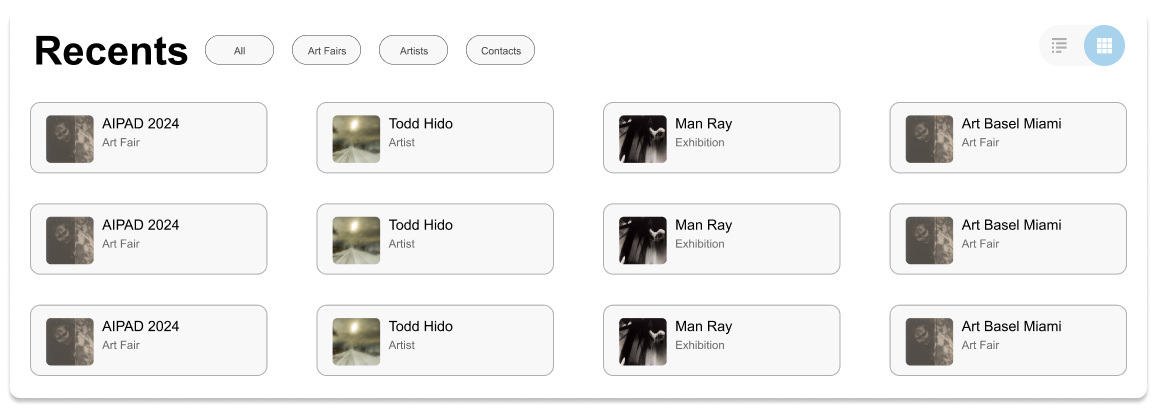
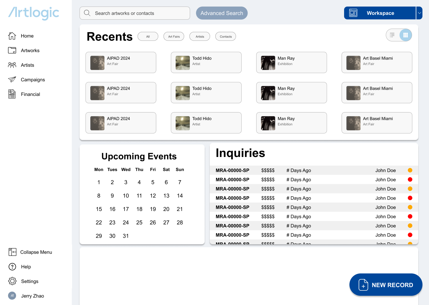
Modular Workspaces
Drawing on the Adobe Creative Suite workspace design convention that creatives are familiar with, users can produce their own spaces depending on their workflow and needs.
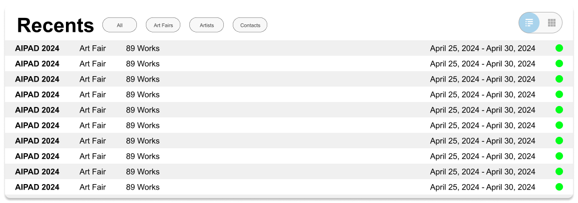
Legacy/Modern Toggle Switch
A bridge between old and new that preserves the legacy, information-dense layout for experienced users who prefer a data-first, image-free interface and more modern image-driven database.
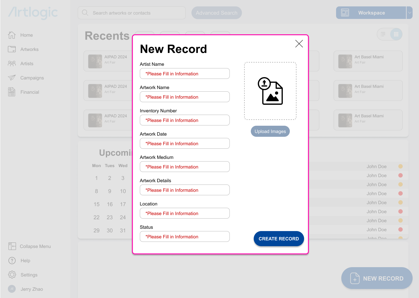
Clear Error Prevention
Increased contrast and greater usage of red to show possible missteps and warnings rather than overuse of brand palette.
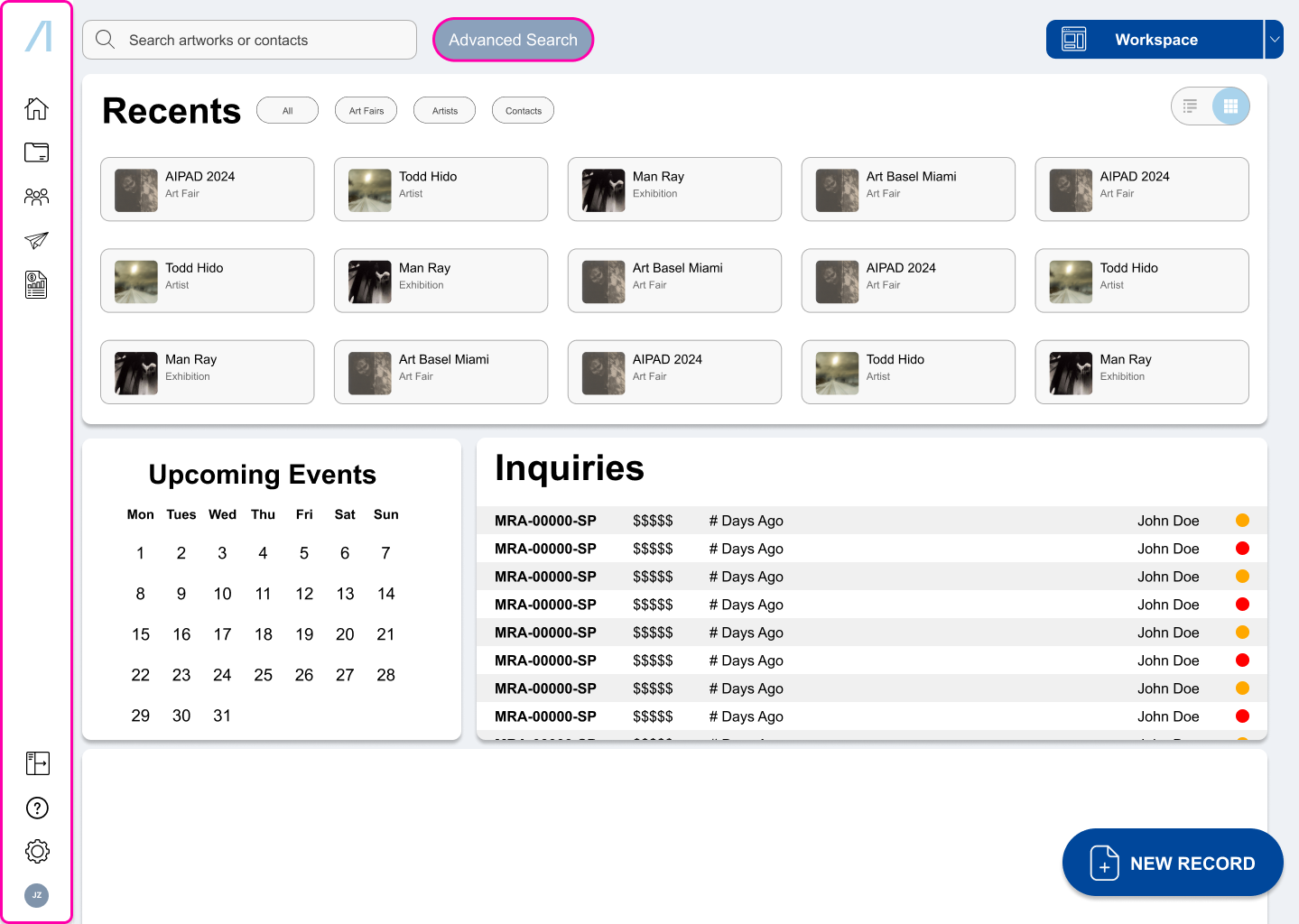
Redundancy Removal
A collapsible side menu with unified utility icons rather than having them scattered across the program and new unified search function.
Execution
Final Product
Reflections
Key Takeaways
Ugly does not mean bad design.
Sometimes the tools that we use are not aesthetically pleasing for a reason. This was one of my first UI projects, and I’ve realized that perhaps I’ve focused too much on the aesthetics. That is why I’m in the process of rebuilding it.
A good design system goes a long way.
After revisiting this project later, I’ve realized that though I though about the design for consumers, I didn’t think about designing the workspace for potential peers who might work on the project with me. This is also part of what is going into my redesign.